Flex box is the new kid on the block in layout tools for CSS. It’s come from a combination of all the various existing grid technologies that were necessary due to the lack of anything like Flex box. The good news is that it’s now widely supported enough to be used on pretty much any website (unless you intend to deploy to Opera mini users). Another advantage is that, because it’s implemented at a browser level, it’s noticeably quicker than CSS ‘hacks’.
So, I’ll show you here a quick overview of flexbox and how to make a simple site skeleton with fixed header and footer and proportionally stretching panels inside.
Flex box takes the idea of proportional scaling of child elements directly into a container with the display type flex.
<div id="app"></div>
	#app {
		display: flex;
	}
This sets the container to flex its children to fit the space. The container will not stretch automatically to the width of the window, and will only stretch to the minimum width of all the children.
Before you can add children to the container, you need to tell the container in which orientation to add the children and therefore in which orientation they will flex. So, if you wanted a panel on the left and right, you would be adding in a row; conversely, a panel top and bottom would be added into a column. The CSS declaration of flex-direction provides this information:
<div id="app"></div>
	#app {
		display: flex;
		flex-direction: row;
	}
Now we can add some children and tell them how to behave with the flex CSS declaration. The flex declaration is shorthand for flex-grow, flex-shrink and flex-basis declarations. flex-grow is going to be the most used, I suspect, as it determines how child containers stretch to fit spaces. It takes a number which is arbitrary, but is effectively a ratio compared to its siblings. So, two siblings with a flex-grow of 1 will stretch to each have half the space; two siblings with 1 and 3, would end up with one sibling having a quarter of the space and the other having three quarters. This does only work if the widths of the child containers are controlled by the parent; so set the parent width then use flex-grow.
	<div id="app">
		<div id="left"></div>
		<div id="right"></div>
	</div>
	#app {
		display: flex;
		flex-direction: row;
		width: 100vw;
		height: 100vh;
		margin: 0;
		padding: 0;
	}
	#left {
		flex-grow: 1;
	}
	#right {
		flex-grow: 3;
	}
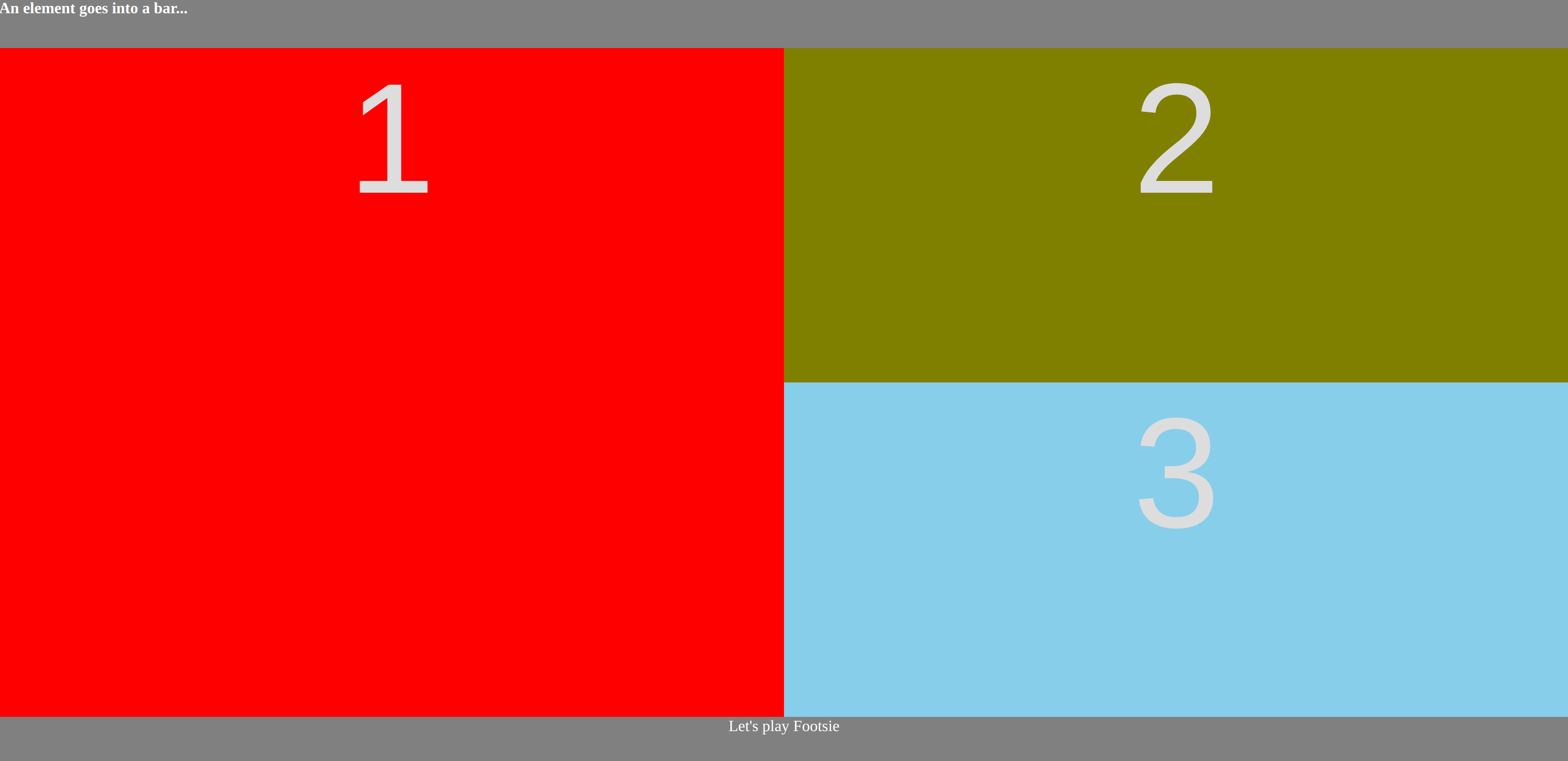
So, once you know this you can easily nest to create more complex arrangements that scale nicely. For example, the following example has three panels, two nested in a right-hand panel. The left panel takes up one quarter of the screen, and the right panel, which is filling the rest of the screen, is split into two equal parts top and bottom.
	<div id="outer">
		<div id="d1"> 1 </div>
		<div id="secondary">
			<div id="d2"> 2 </div>
			<div id="d3"> 3 </div>
		</div>
	</div>
	#outer {
		display: flex;
		flex-direction: row;
		width: 100vw;
	}
	#d1 {
		flex-grow: 1;
	}
	#secondary {
		display: flex;
		height: 100vh;

		flex-direction: column;
		flex-grow: 3;
	}
	#d2 {
		height: 100%;
		flex-grow: 1;
	}
	#d3 {
		height: 100%;
		flex-grow: 1;
	}
 The code for this example is in the simple example.
Because the size of the flexible area is quite easy to stipulate within the CSS, having a fixed-height header and/or footer bar becomes a case of using CSS’s calc function to set the size of the flexible area to not include those outer elements. For example:
	<nav> An element goes into a bar... </nav>
	<div id="outer">
		<div id="d1"> 1 </div>
		<div id="secondary">
			<div id="d2"> 2 </div>
			<div id="d3"> 3 </div>
		</div>
	</div>
	<footer> Let's play Footsie </footer>
	nav {
		height: 50px;
	}
	footer {
		height: 50px;
	}
	#outer {
		height: calc(100vh - 100px);
		...
	}
 The code for this example can be found in the header/footer example.
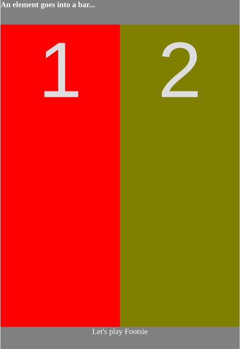
It’s no big jump to realise that this plays pretty nicely into media queries and forming nicely responsive websites. The following example is plainly dumb, but you can work out that it’d be pretty simple to rearrange the weightings or shift into a vertical flex layout as the screen narrows.
	@media only screen and (max-width: 500px) {
		#d3 {
			display: none;
		}
	}

FlexBox is a clearly a massive step forward from all the fussiness of those grid frameworks. If you want a fun way to learn about some of the FlexBox CSS declarations, try the fun FlexBox Froggy.
The examples in this post are available at this repo.
Do you have any good tips for using FlexBox? Let me know in the comments below.

Comments: